Psagot Investment House
Creating an alternative website \\ Product design experience
Overview
Psagot is Israel's largest investment house. On behalf of its close to one million private investors, business clients, and institutional clients, Psagot manages approximately 184 billion NIS. The investment house offers its clients a wide range of investment tracks and investment instruments adapted to meet investors' various needs. Psagot’s website reflects all that.
The Goal
Upgrading Psagot Investment House's marketing site.
The Problem
During the digital department's meeting, the following issues were addressed that needed to be fixed: there is no uniformity to the visual marketing website and there is no unique concept that separates Psagot's website from other competitors in the financial market. The website appears to be a pile of different design languages that the company has replaced over the years. Every page looks different from each other, identical icons are used for different meanings, and there is a lack of uniformity in the fonts and buttons.
Psagot’s site
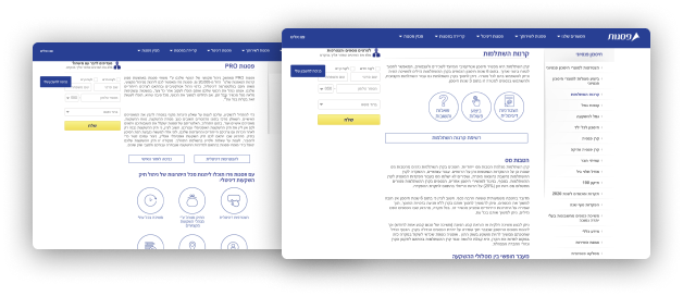
One can't always distinguish between an icon and a button
In addition, identical icons are used for different meanings
In addition, identical icons are used for different meanings
Every product page looks different from the other
The Solution
The guidelines for the concept for the updated website were inspired by "a lead in responsibility." This value was derived from the vision and values of the company.
My process
Our next step was formulating the concept. I'm bringing in two concepts that have been gathered by my two crew members as you can see here.

Psagot accompanies you at every stage of your life

The North Star is always there to show the way
Psagot accompanies you at every stage of your life concept did not fit because many of the competitors have similar images on their site. The North Star idea has been disqualified since there are several products in Psagot and there will be a problem attributed to each specific product an image.
I offered two concepts.
My first concept:
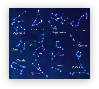
The first one is creating a "Wheel of products" like the zodiac for each product will have its own icon. The image from which the idea was derived: Stars- the North star showing the way- navigation. Both the capital market and astrology have a desire to know what the future holds. TASE investors want to know which shares should invest in so they will earn more in the long term.
I offered two concepts.
My first concept:
The first one is creating a "Wheel of products" like the zodiac for each product will have its own icon. The image from which the idea was derived: Stars- the North star showing the way- navigation. Both the capital market and astrology have a desire to know what the future holds. TASE investors want to know which shares should invest in so they will earn more in the long term.
My second concept:
The capital market is like discovering a new world for most of the population, in particular the products Psagot offers. Hence the imagery from which the idea was derived - an experienced instructor who knows where to turn and how to lead - a map.
The capital market is like discovering a new world for most of the population, in particular the products Psagot offers. Hence the imagery from which the idea was derived - an experienced instructor who knows where to turn and how to lead - a map.
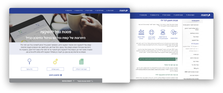
The chosen concept is to create a map whose overall shape will be built from the Psagot logo. The colors will be divided by product types.
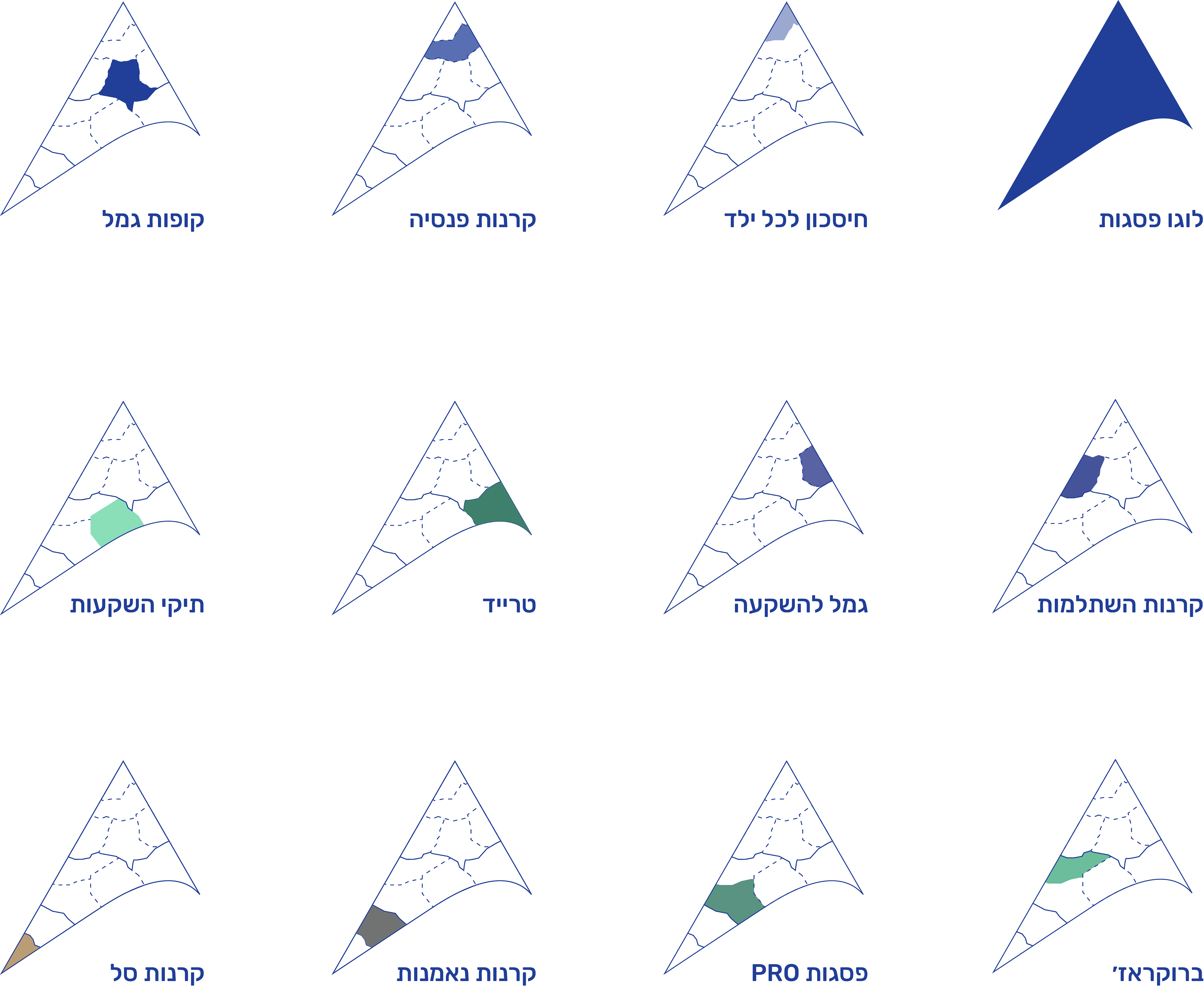
The main problem was showing the relation between the product page and its own main category on the home page. In order to solve this problem, I used map iconography.
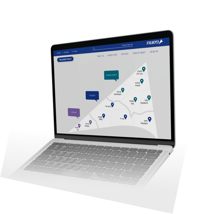
On the home page, the map is divided into three parts according to the types of products that Psagot offers. These parts symbolize continents. Each one is marked with a different color. Within each main category (continent) there are products that symbolize the countries.
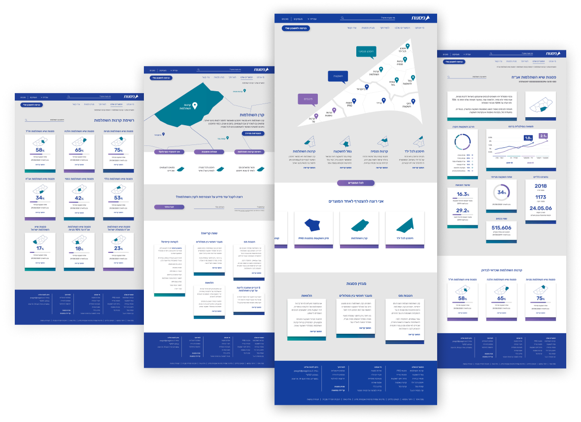
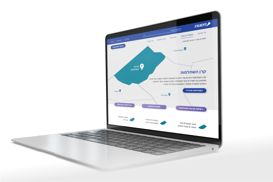
According to google analytics, most customers come directly to the product page after Google search. Therefore, the solution in implementing the visual component is presented in such a way that it will be understandable to the user that does not come from the home page and see the map as a whole. An image of the map with an emphasis on the placement of the product.